Tabs

Sunday, January 31, 2016

Forever Friends

Happy Sunday again stampers! I couldn't stop playing with these Botanical Builder framelits. So I decided not to wait to post for another day and to share another card with you. I hear your excitement from over here! So without further ado.


Color Combination:  


Measurements:

Crumb Cake card base 4 ¼” x 11” scored at 5 ½”
Smoky Slate 4 1/8” x 5 3/8”  
Botanical Gardens DSP 4” x 5 ¼”
Crumb Cake Banner 1” x 3”


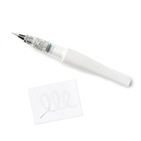
I love that you can layer as much or as little as you want with these framelits. The flowers come out to be so different each time. Oh and this is the first time using the Kraft Corrugated paper. I had cut out the leaves and used the Clear Wink of Stella® glitter brush in the “valley” sections. Using the Clear Wink of Stella® glitter brush on the flowers, buttons and the “forever” wording on the banner. The sparkle just adds that bit of goodness for this flowery friendship card.


I used the layout from Create with Connie and Mary (#CCMC391).  


 I used the color combination from Color Throwdown (#CTD377).


Thank you for returning today. Be sure to come back tomorrow to view what the Blogging Friends are sharing on the February hop. 

Product List

Celebrate Today

Happy Sunday stamping friends! I really didn’t think I was going to like the Botanical Blooms product suite. Boy was I wrong! I think the framelits are my favorite from the suite. You’ll want to add it to your wishlist too!


I'm joining some of my fellow Stampin' Up! demonstrators to help keep "snail mail" alive in a movement called #imbringingbirthdaysback. A huge part of the reason I love making cards is being able to send them in the mail to help brighten someone's day. So help me bring birthdays back! If you would like to receive a hand stamped card in the mail for your birthday, leave your birthday in the comments below. Then subscribe to my blog posts so I can receive your address and I'll send you a handmade card. 

Measurements: 

Whisper White card base 4 ¼” x 11” scored at 5 ½”
Everything else is using scrap pieces of card stock or directly on the card base


Clear Wink of Stella® glitter was added to the black center to enhance it a bit. This flower is really cool with it being partially cut and embossed to allow the petals to seperate but still be together at the same time.

Thank you for stopping by today. Be sure to return tomorrow to see what more I craftiness I want to share with you. 

Product List

Saturday, January 30, 2016

New Two

Happy Saturday my crafty friends! Hope you are prepared. I'm taking you behind the scenes of how I came up with the two cards I want to show you today. I’m submitting these for both a challenge and for applying for a design team member position. They are to show my creativity and style. I wouldn’t say that I have a certain style but I am one that loves to craft and hope it shows. You too can apply, there are three open design team positions. Interested CLICK HERE for more details.

Color Combination:


Measurements:

Blushing Bride 4 ¼” x 11” scored at 5 ½”
Tip Top Taupe 3" x 4" 
Perfectly Artistic DSP 2 7/8" x 3 7/8"
Gold Fancy Foil Vellum 2 7/8" x 3 7/8"
Tip Top Taupe 1" Lace Trim and Whisper White 5/8" Organza ribbons 14" each

Ready to see my first card?

Since love has been in the air lately. Well I've been creating lots of Valentine based cards and projects. I thought it would be a great idea to get started on some wedding/engagement cards. This next card is very "pink" but you can interchange the colors to match the specifics for the new couple.  


Originally started the card with stamping the sentiment first directly to the card base. There now lies the first of many tweaks I had made along the way. The whole image didn't stamp properly but you wouldn't have known that unless I told you. 


I’m going to let you on a secret. Shhh don't let anyone else know. The "two" was stamped blotchy. Guess not enough ink or not enough pressure. I thought of restamping (knew that wasn't going to happen because the chances of it lining up again were very slim.) I could have used the Stamp-a-majig but I should have used that to begin with. Then thought about starting over but then I wasted a perfectly good card base. So I measured the word "two" and took out the Large Number framelits to see if I stamped on a cut out of the "2" in the same color it would be like I intentionally made the card that way. BINGO! I was going with the last option because the wording fit perfectly on the framelit cutout. This time I stamped with VersaMark and poured gold embossing powder over the image and heat set it. I wanted it to stand out a bit. Not to call attention to my mistake but to show the number 2 is there acting like a pun but is on purpose to represent the two people. I also added a Blushing Bride glimmer heart for some more eye candy. What do you think? Different huh? Yeah well that's me. Unique. 


Ready for the inside of the card? I generally do not stamp the inside until I’m ready to use the card. The sentiment on the inside was lonely and I needed to add something. Initally I had the stamped heart images ready to use on the DSP on the front. With all the tweaking that took place I thought it would be good to use it on the inside. Leaving the front of the card to show the Perfectly Artisitic DSP (symbolising the blending of two lives), the hearts to represent lots of love the two people share and the two ribbons tied in a knot (symbolising the bond of marriage). Too much mushy gushy? 


I had thought to pop up the two bird heart with gold foil heart on top of the DSP and ribbon. Glad I had a backup plan. I am happy this stamp had two love birds on it so I could color them using my Tip Top Taupe Stampin’ Write Marker. Using my White Gel pen I gave them each an eye. I think you can see it in the picture below. I just love how the birds are facing eachother too! Are you ready to see the next card? Keep scrolling past the product list. 


Product List


Thank you for continuing to scroll down. I have a masculine card to show you next. First of all what do you think of the color combination? 

Color Combination:


Measurements:

Soft Suede card base 4 ¼” x 11” scored at 5 ½”
Cajun Craze 4" x 5 ¼” sponged with Cajun Craze ink and embossed with Boho Chic
Always Artichoke punched with the 2 ½” Circle
Watercolor Paper cut with the smallest Deco Label framelit

I chose to make a masculine card for two reasons. First The Wilderness Awaits stamp set has been in my craft room unused. I know HOW is that possible? Next masculine cards are never easy to make unless your man doesn’t mind flowers and different colors.


Narrowing down which image I was going to use was difficult since I didn’t know how I was going to layout the card. So I started with the fox. Stamping the fox on Watercolor paper and my handy Aqua Painters I started to color with Cajun Craze. Going over the areas again for a darker more defined look. You'll see it better in the next photo. Colored the grass with the Always Artichoke (again going over the grass blades to make it look darker) and the sky with Lost Lagoon. I added a hint of Soft Suede to his ears and nose. So my focal point was completed but needed to figure out the rest of the card. 

I continue on the basis of what haven't I used in a while. Boho Chic embossing folder was in my hands. I choose to stick with the colors I had used on my fox image. I tore the bottom right side of the Cajun Craze thinking it would be a great spot for my tired fox. This will give the rest of the area the attention of the embossing image. Ran it through my Big Shot and then sponged to make it look a bit rustic. It was all coming together but needed a senitment. I stamped the "For You" on Cajun Craze card stock with Soft Suede ink. Punched it out of the Word Window and punched a 1 1/16" hole to allow the Linen Thread through. Wrapped the Linen Thread around the Cajun Craze embossed piece and tied a bow. I like just having a few masculine cards on hand that have multipurpose use. Could be a Thinking of You, Birthday, Thank You, Just Because, etc. I left the inside of this card blank.


Here is a closer view of the fox and that hard to see Always Artichoke 2 ½” Circle. Isn't this fox image pretty. The Stampin' Up! image artists do an excellent job of keeping the images almost life like.  


I played along with The Watercooler Wednesday Challenge (#WWC52).


Thank you for stopping by today. Hope you enjoyed my two cards and the behind the scenes look at how I created them. I know I generally do not go into that much detail on my daily posts but I thought you would appreciate it. See you back here same time same place tomorrow?

Product List