Happy Saturday my crafty friends! Hope you are prepared. I'm taking you behind the scenes of how I came up with the two cards I want to show you today. I’m submitting these for both a challenge and for applying for a design team member position. They are to show my creativity and style. I wouldn’t say that I have a certain style but I am one that loves to craft and hope it shows. You too can apply, there are three open design team positions. Interested CLICK HERE for more details.
Color Combination:
Measurements:
Blushing Bride 4 ¼” x 11” scored at 5 ½”
Tip Top Taupe 3" x 4"
Perfectly Artistic DSP 2 7/8" x 3 7/8"
Gold Fancy Foil Vellum 2 7/8" x 3 7/8"
Tip Top Taupe 1" Lace Trim and Whisper White 5/8" Organza ribbons 14" each
Ready to see my first card?
Since love has been in the air lately. Well I've been creating lots of Valentine based cards and projects. I thought it would be a great idea to get started on some wedding/engagement cards. This next card is very "pink" but you can interchange the colors to match the specifics for the new couple.
Originally started the card with stamping the sentiment first directly to the card base. There now lies the first of many tweaks I had made along the way. The whole image didn't stamp properly but you wouldn't have known that unless I told you.
I’m going to let you on a secret. Shhh don't let anyone else know. The "two" was stamped blotchy. Guess not enough ink or not enough pressure. I thought of restamping (knew that wasn't going to happen because the chances of it lining up again were very slim.) I could have used the Stamp-a-majig but I should have used that to begin with. Then thought about starting over but then I wasted a perfectly good card base. So I measured the word "two" and took out the Large Number framelits to see if I stamped on a cut out of the "2" in the same color it would be like I intentionally made the card that way. BINGO! I was going with the last option because the wording fit perfectly on the framelit cutout. This time I stamped with VersaMark and poured gold embossing powder over the image and heat set it. I wanted it to stand out a bit. Not to call attention to my mistake but to show the number 2 is there acting like a pun but is on purpose to represent the two people. I also added a Blushing Bride glimmer heart for some more eye candy. What do you think? Different huh? Yeah well that's me. Unique.
Ready for the inside of the card? I generally do not stamp the inside until I’m ready to use the card. The sentiment on the inside was lonely and I needed to add something. Initally I had the stamped heart images ready to use on the DSP on the front. With all the tweaking that took place I thought it would be good to use it on the inside. Leaving the front of the card to show the Perfectly Artisitic DSP (symbolising the blending of two lives), the hearts to represent lots of love the two people share and the two ribbons tied in a knot (symbolising the bond of marriage). Too much mushy gushy?
I had thought to pop up the two bird heart with gold foil heart on top of the DSP and ribbon. Glad I had a backup plan. I am happy this stamp had two love birds on it so I could color them using my Tip Top Taupe Stampin’ Write Marker. Using my White Gel pen I gave them each an eye. I think you can see it in the picture below. I just love how the birds are facing eachother too! Are you ready to see the next card? Keep scrolling past the product list.
Product List
Thank you for continuing to scroll down. I have a masculine card to show you next. First of all what do you think of the color combination?
Color Combination:
Measurements:
Soft Suede card base 4 ¼” x 11” scored at 5 ½”
Always Artichoke punched with the 2 ½” Circle
Watercolor Paper cut with the smallest Deco Label framelit
I chose to make a masculine card for
two reasons. First The Wilderness Awaits stamp set has been in my craft room
unused. I know HOW is that possible? Next masculine cards are never easy to
make unless your man doesn’t mind flowers and different colors.
Narrowing down which image I was going
to use was difficult since I didn’t know how I was going to layout the card. So
I started with the fox. Stamping the fox on Watercolor paper and my handy Aqua Painters I started to color with Cajun Craze. Going over the areas again for a darker more defined look. You'll see it better in the next photo. Colored the grass with the Always Artichoke (again going over the grass blades to make it look darker) and the sky with Lost Lagoon. I added a hint of Soft Suede to his ears and nose. So my focal point was completed but needed to figure out the rest of the card.
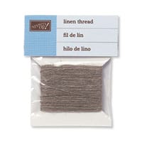
I continue on the basis of what haven't I used in a while. Boho Chic embossing folder was in my hands. I choose to stick with the colors I had used on my fox image. I tore the bottom right side of the Cajun Craze thinking it would be a great spot for my tired fox. This will give the rest of the area the attention of the embossing image. Ran it through my Big Shot and then sponged to make it look a bit rustic. It was all coming together but needed a senitment. I stamped the "For You" on Cajun Craze card stock with Soft Suede ink. Punched it out of the Word Window and punched a 1 1/16" hole to allow the Linen Thread through. Wrapped the Linen Thread around the Cajun Craze embossed piece and tied a bow. I like just having a few masculine cards on hand that have multipurpose use. Could be a Thinking of You, Birthday, Thank You, Just Because, etc. I left the inside of this card blank.
Here is a closer view of the fox and
that hard to see Always Artichoke 2 ½” Circle. Isn't this fox image pretty. The Stampin' Up! image artists do an excellent job of keeping the images almost life like.
I played along with The Watercooler Wednesday Challenge (#WWC52).
Thank you for stopping by today. Hope
you enjoyed my two cards and the behind the scenes look at how I created them.
I know I generally do not go into that much detail on my daily posts but I
thought you would appreciate it. See you back here same time same place tomorrow?
Product List











Leanne, both your cards are nicely done. Your first card is not too "mushy,cushy", I love the colors and you covered your mistakes nicely. (Read the back of Betty Lee's card...you never have mistakes only opportunities) The second card is really nice. The fox is beautifully colored.
ReplyDeleteThank you Heather.
DeleteHi Leanne, you never disappoint. What lovely cards you've created for the challenge and your application for the Design Team. I especially love the details of how you found a way to change a "failure" into a success. It's annoying when you take such care with everything and then a piece of critical stamping is botched. Been there! Adding the large "2" and using it as a bonus instead of giving up and beginning again really is a great story and also helped you create an outstanding card. Thanks so much for joining us this week for our Watercooler Wednesday Challenge.
ReplyDeleteThank you Heidi!
DeleteClever girl to rescue your project so beautifully. And sharing the details so others can see how to view such things and brainstorm solutions. Your lovely cards (love that fox!) are a wonderful addition to our Watercooler Wednesday Challenge and Design Team call. Thanks for joining us this week.
ReplyDeleteThakn you Jean!
Delete